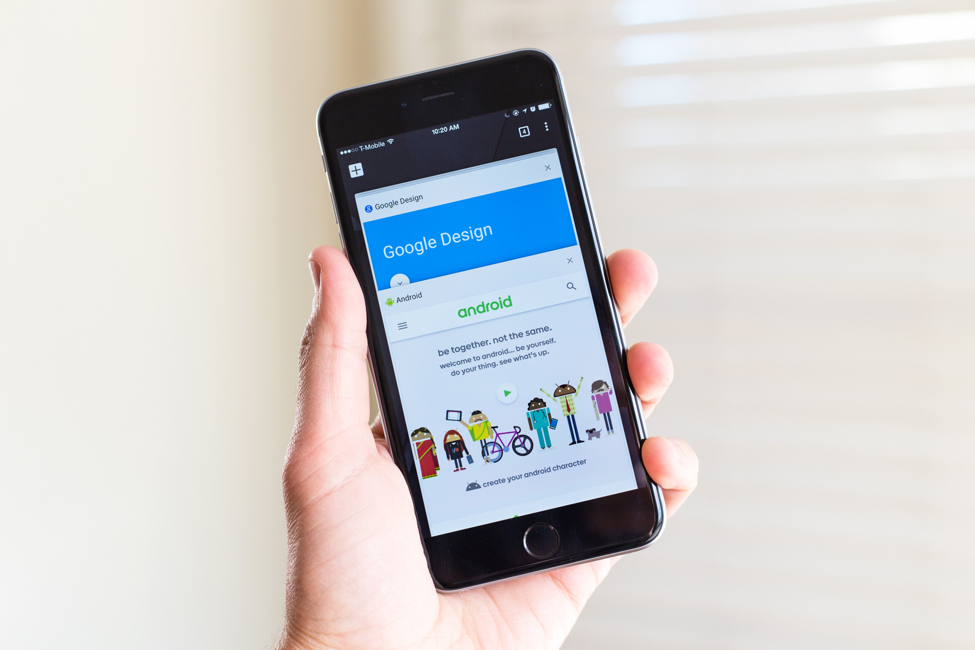
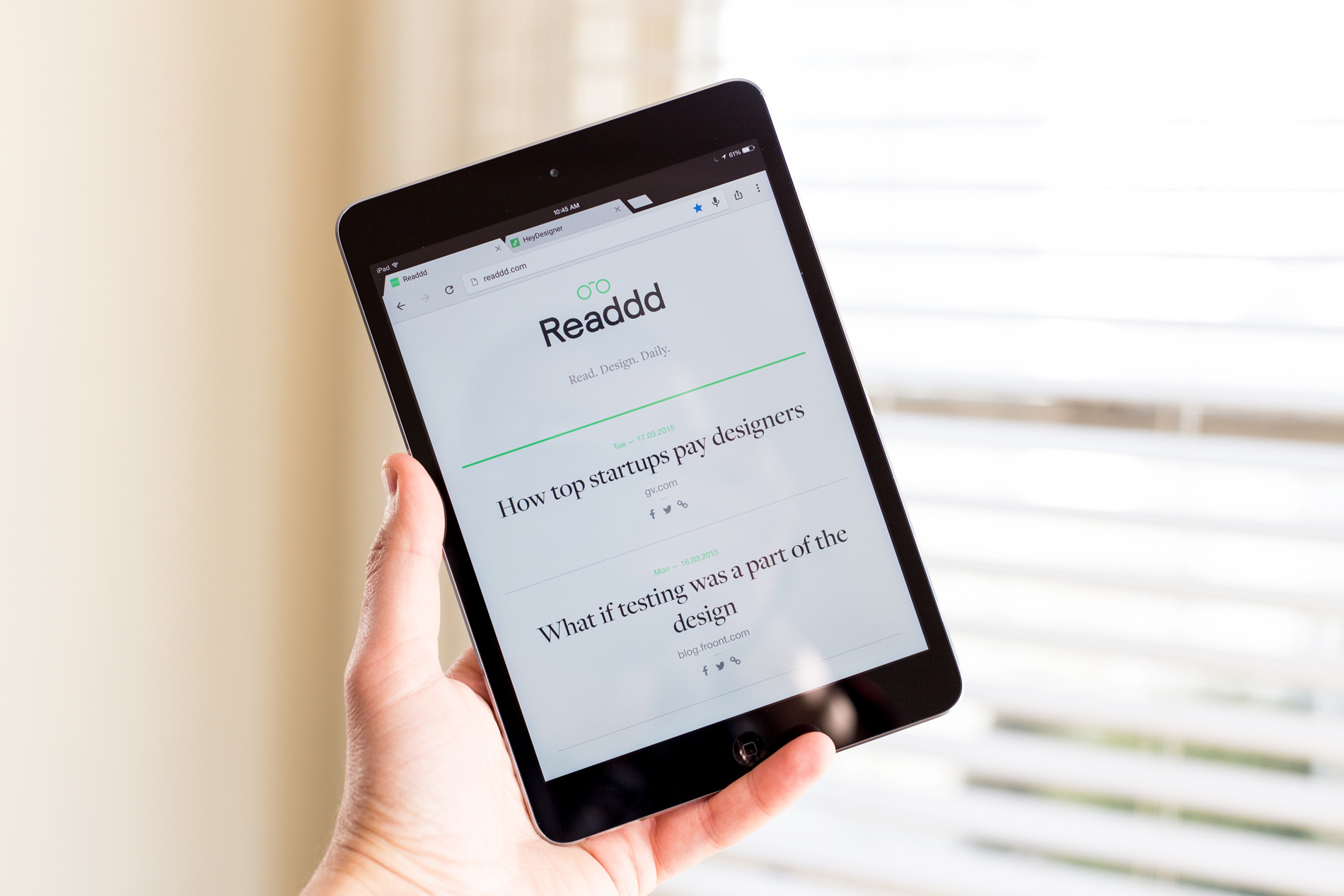
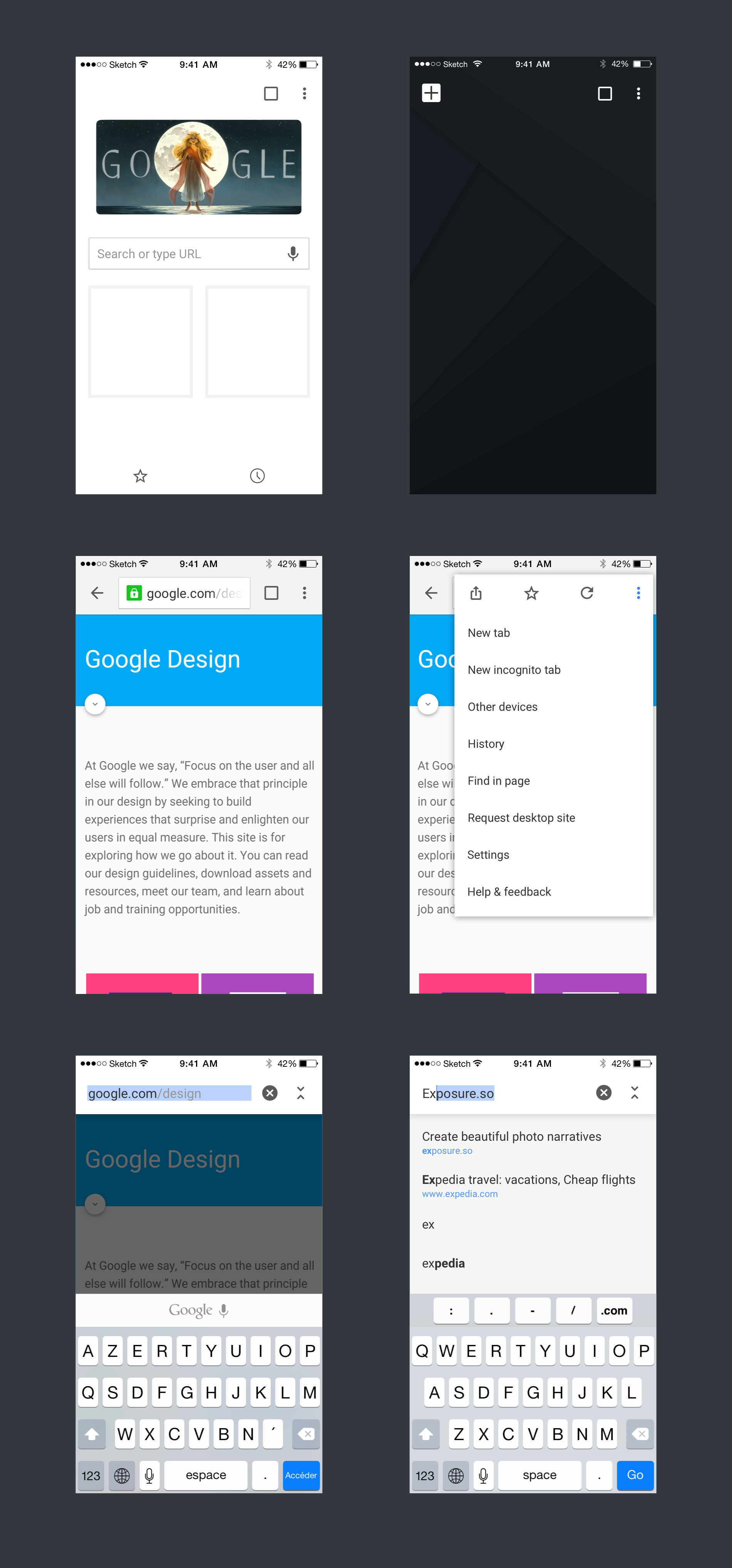
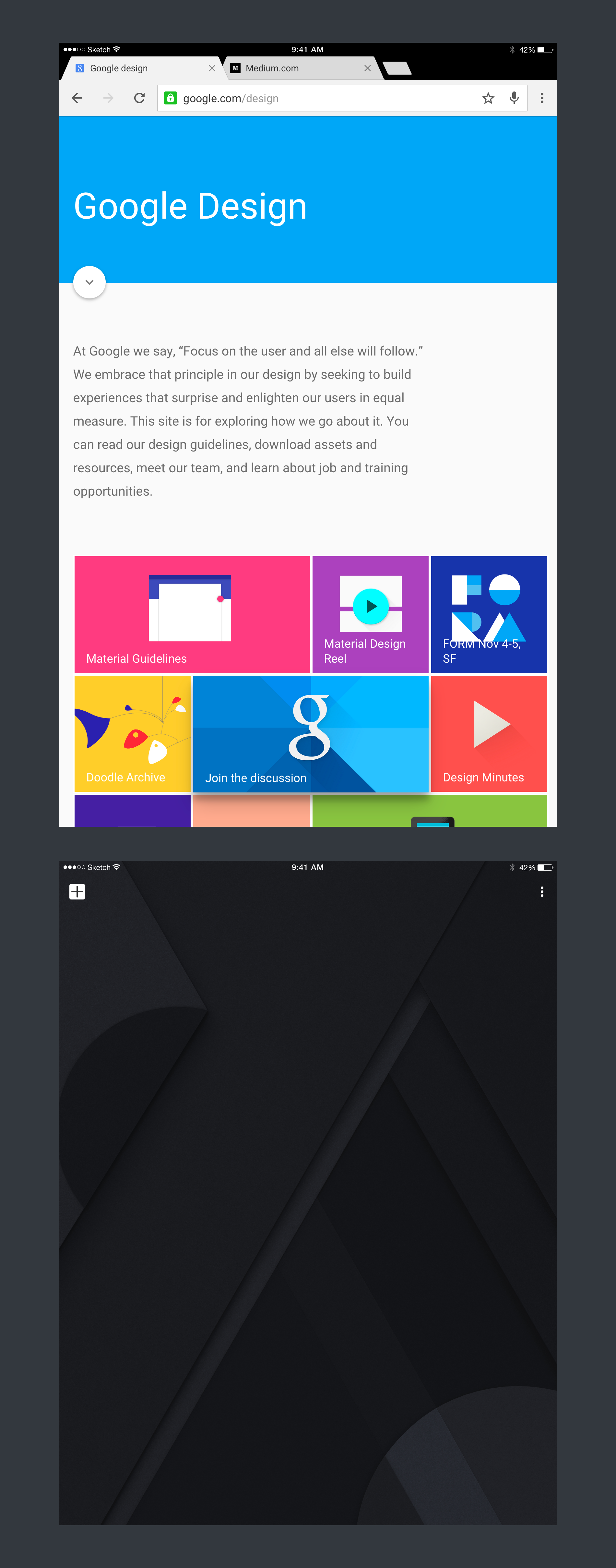
After the Material design redesign of Chrome for Android came iOS in version 42. Following the same principle, a lot of the visual design resource where used to keep Chrome consistent everywhere. As a matter of fact both versions were designed at the same time.
A lot of platform specific features where implemented and perfected for this version such as the addition of the back button, the share menu for tablet and a very powerful pull to refresh, open/close tab.
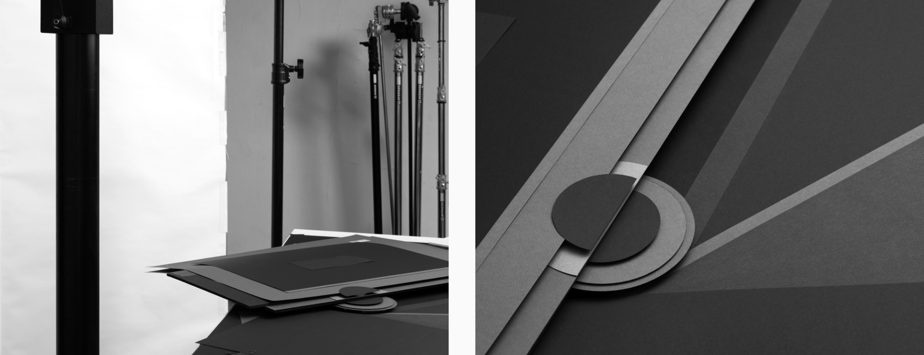
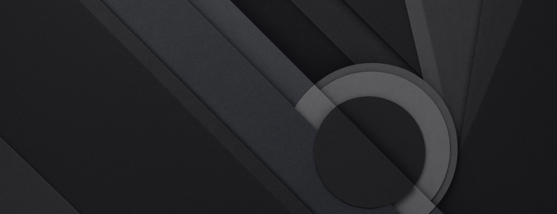
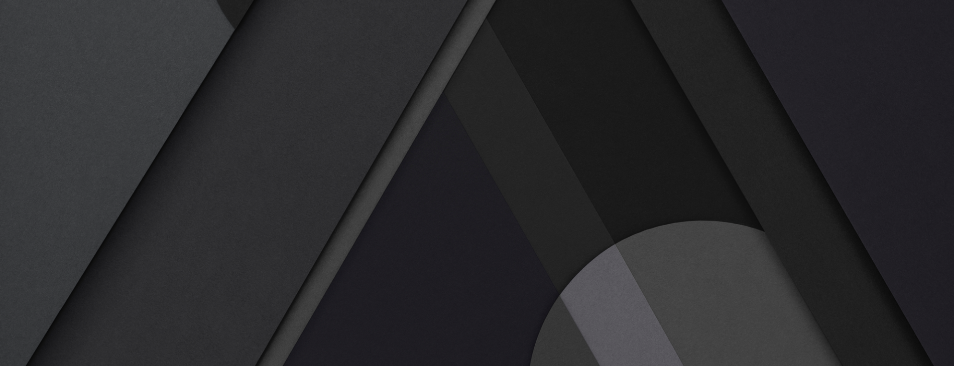
In addition, we worked with the Artist Karl Kleiner who previously created the Material design colorful paper background, to create the tab background image. You can see a few pictures of the final result as well as a work in progress shot in his studio.
Props to the Chrome designers @cleer and @peteschaffner for their work on this project.
