Chrome 50 for desktop saw one of the its biggest revamp in 4 years. This project that spanned across an entire year and for which I was the visual lead consisted in redesigning Chrome core UI from the ground up for all desktop platforms. Starting with Chrome OS, we entirely rethought the way Chrome is implemented, starting by removing any type of bitmap assets such as .png to entirely render it programmatically, which removed a total of ~1200 pngs. Chrome should now scale way better across PPIs, including on Windows when it will be deployed.
In addition, we brought Material motion to the core UI with complex morphing ripples and bubbles burst on the icons. We also created two different layout: One mouse optimized layout and a more spaced-out one that we are calling "hybrid", which will be deployed by default on touch-enabled Chromebooks. The goal of the layout is to enable better touchability without comprimising layout density and productivity.
Also new with Chrome, we introduced a fully re-themed Incognito mode, sporting a beautiful black layout from the tabs to the toolbar and even the NTP and omnibox dropdown.
Chrome normal layout
The Chrome normal layout is the default Chrome UI we've known over the years. Optimized for mouse-only input, it is currently deployed on all desktop platforms. Starting with non-touchscreen Chromebooks, the new Chrome Material version will bring a complete visual refresh to this layout.
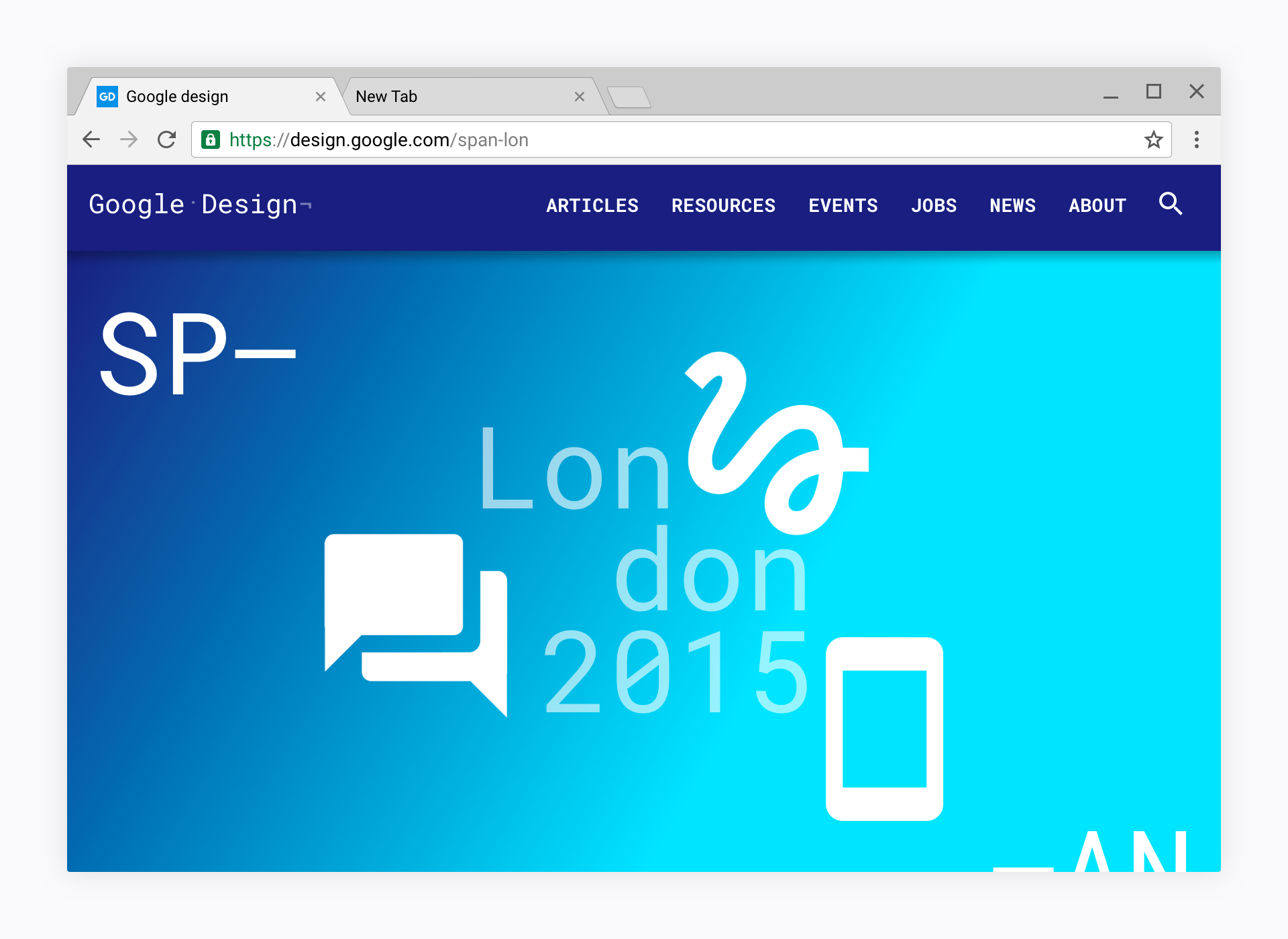 Chrome normal layout, in default mode.
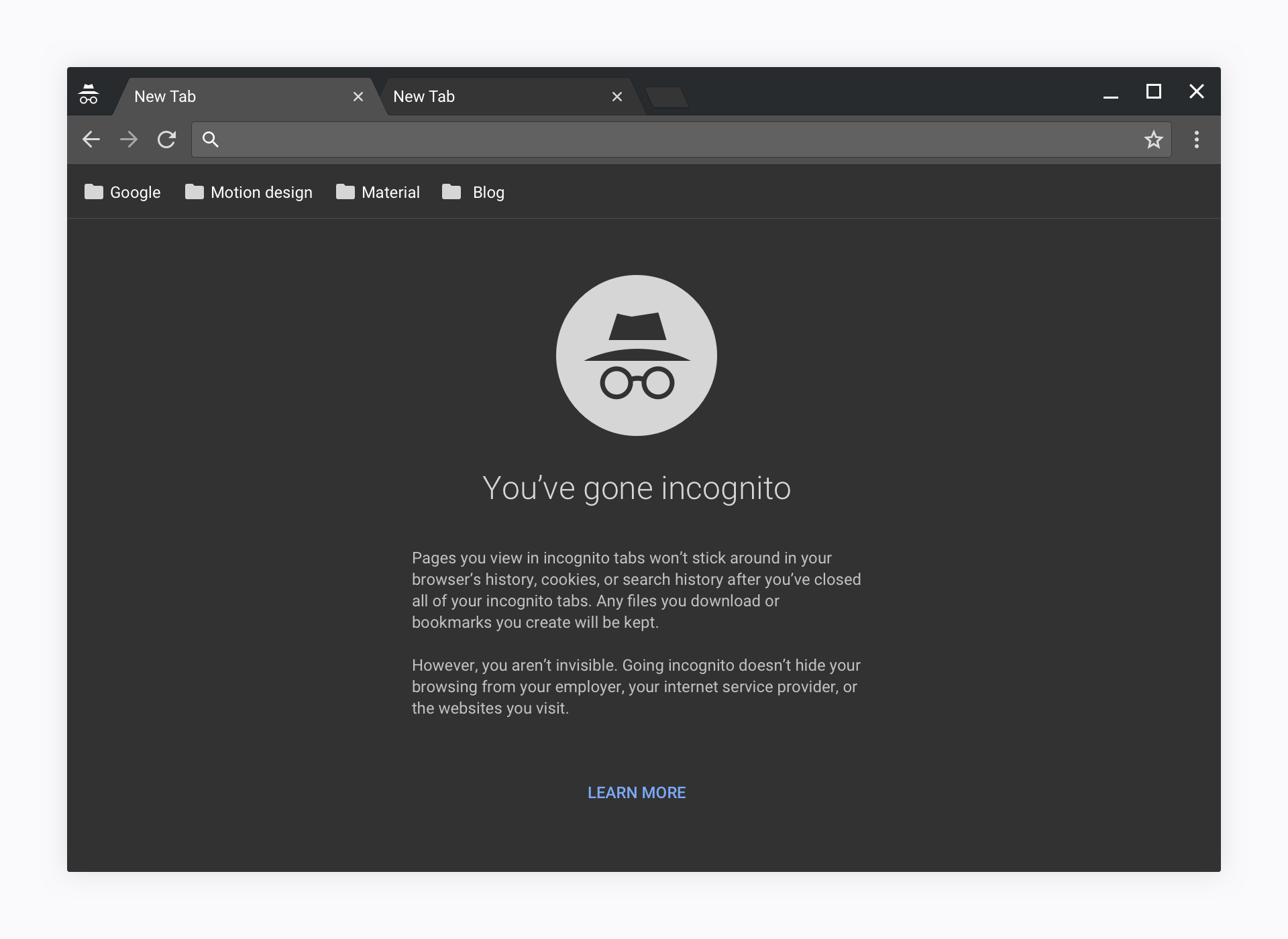 Chrome normal layout, in incognito mode.
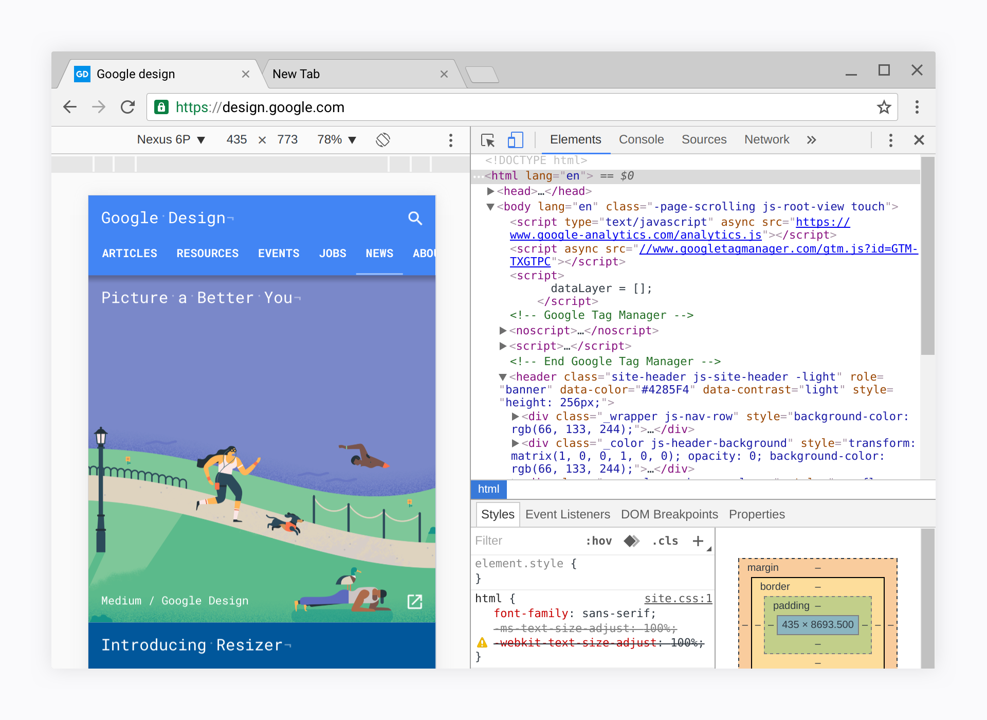 Chrome Material design with dev tools (dev tools designer Max Walker)
 Chrome normal layout omnibox dropdown
 Chrome incognito layout omnibox dropdown
Chrome Hybrid layout
Coming with this redesign, the "Hybrid" layout which aims at Hybrid devices such as convertibles and touch-screen enabled computers enables better touchability while compromising as little as possible on productivity. This layout will be deployed first by default on touchscreen Chromebooks only.
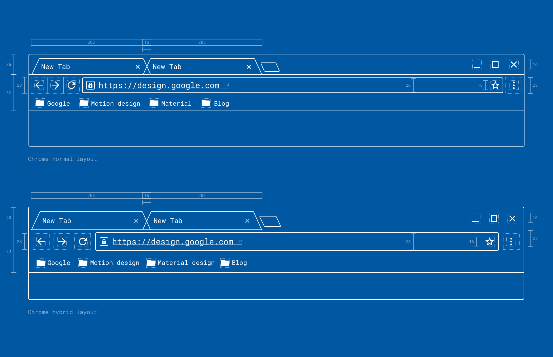 The size difference between Chrome normal layout and Hybrid layout
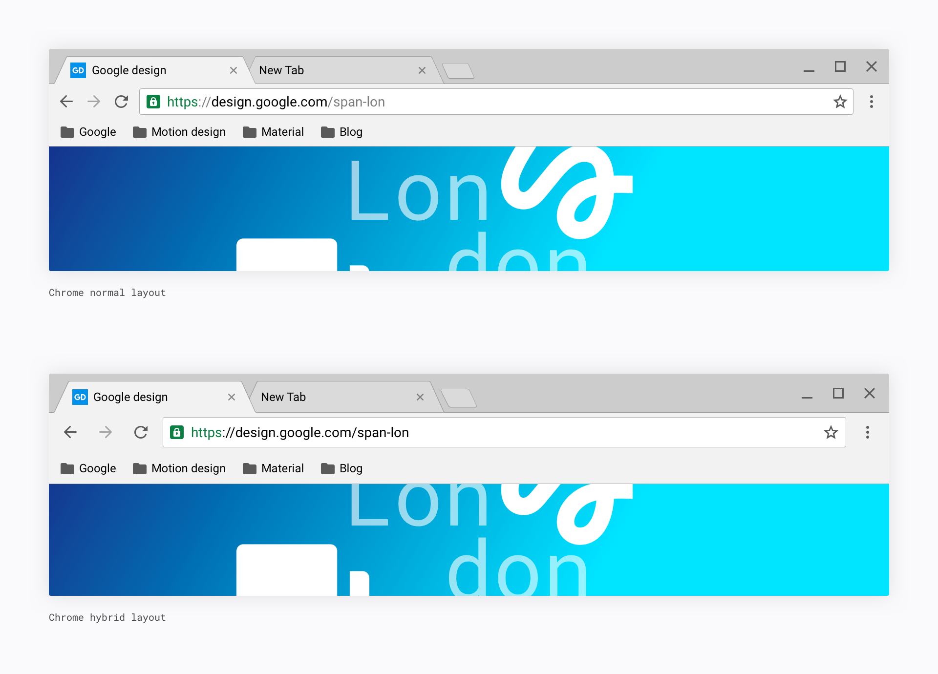 Chrome normal vs. Chrome hybrid visualization
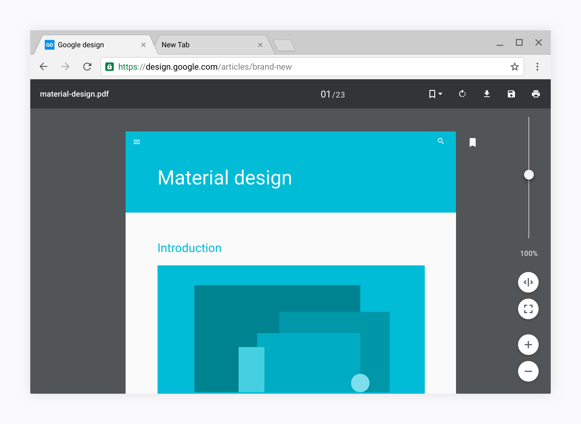 Chrome Hybrid with the new .pdf viewer by Cody Sielawa
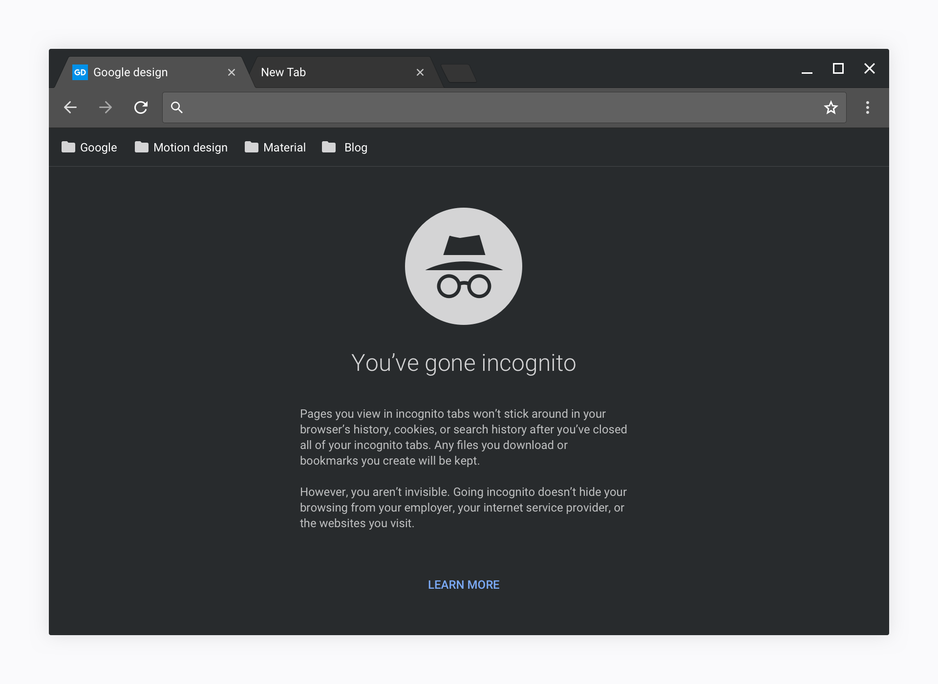 Chrome Hybrid incognito
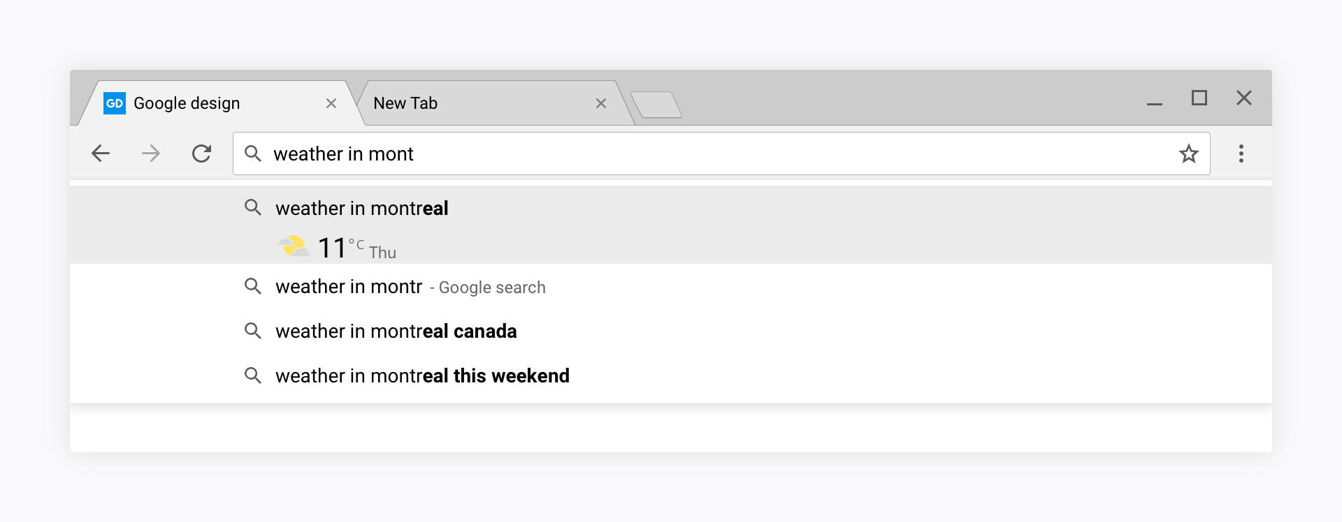 Chrome hybrid layout omnibox dropdown
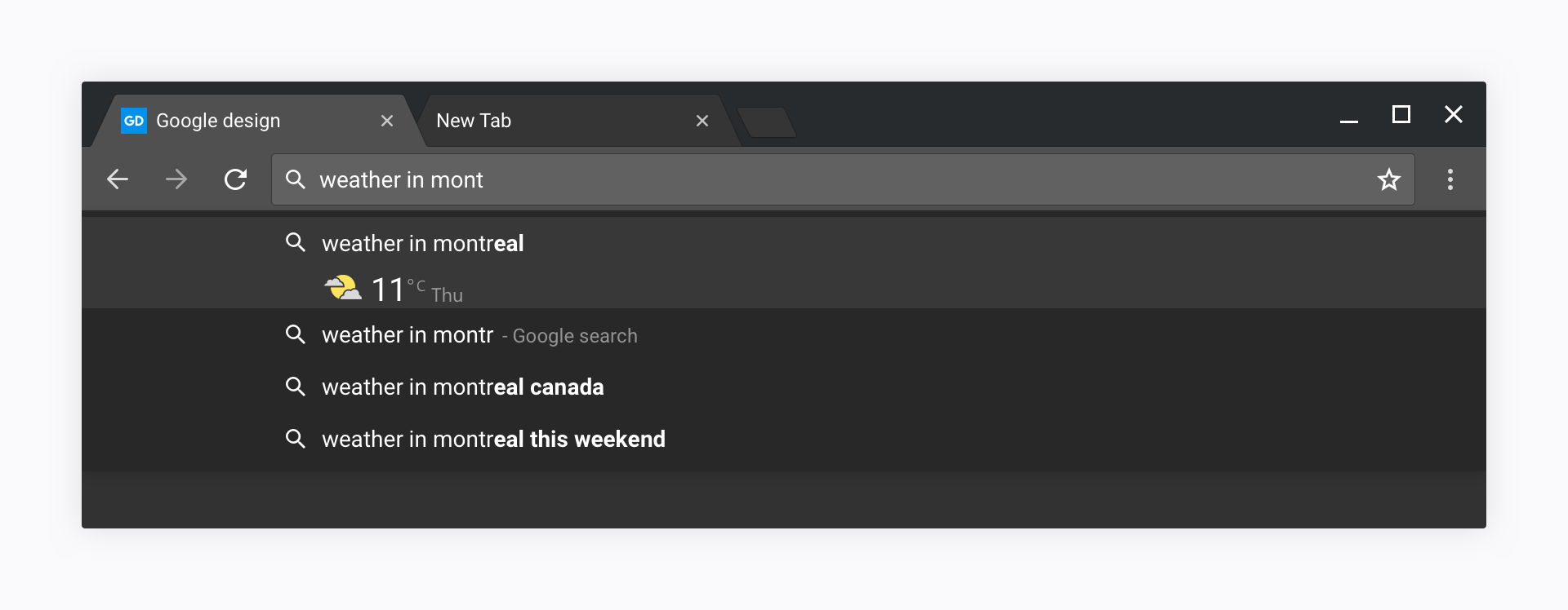 Chrome hybrid incognito layout omnibox dropdown
Common elements
Compoents that you can find in both Normal and Hybrid mode. Beside spacing, everything is shared between the two versions, including iconography and motion.
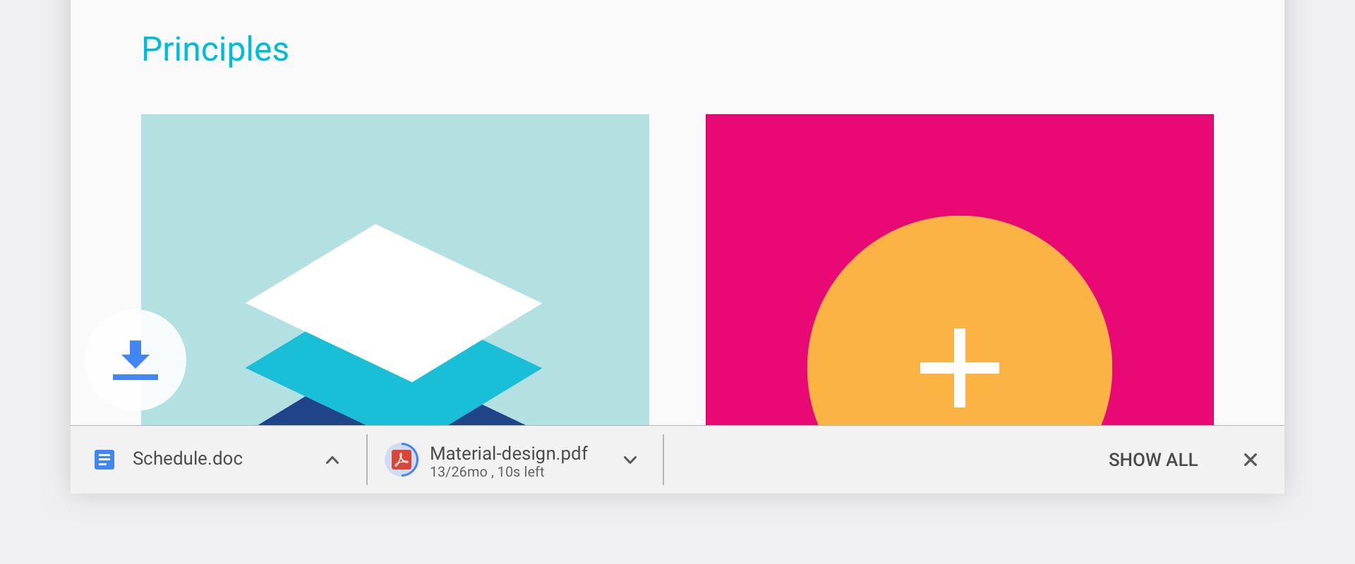 The new download shelf, will be available on Windows, replace by notification on Chrome OS
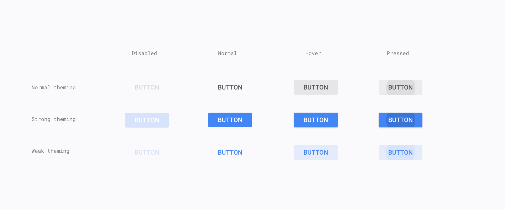 New MD buttons for dialogs and secondary UI
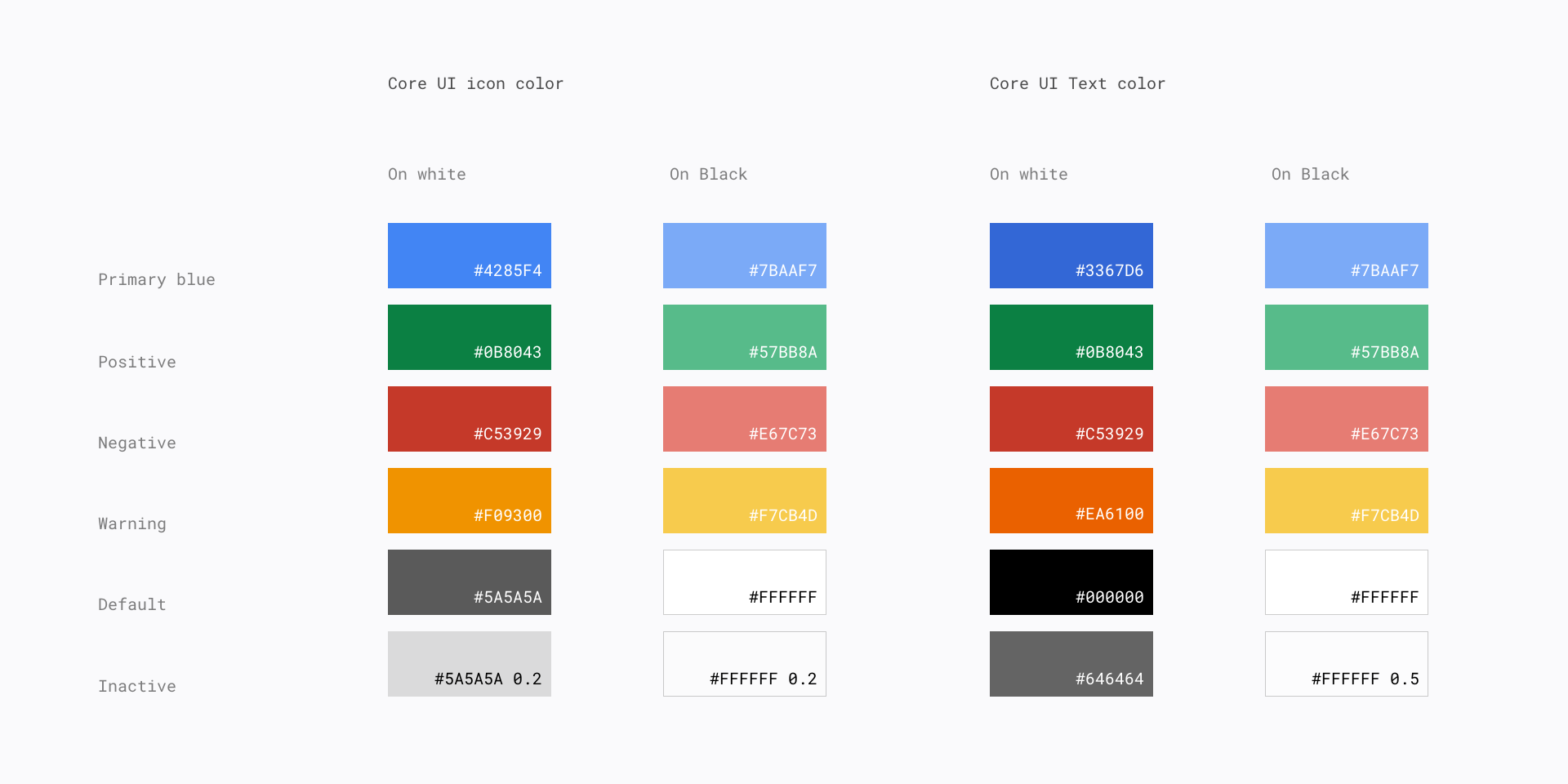 Chrome basic color scheme
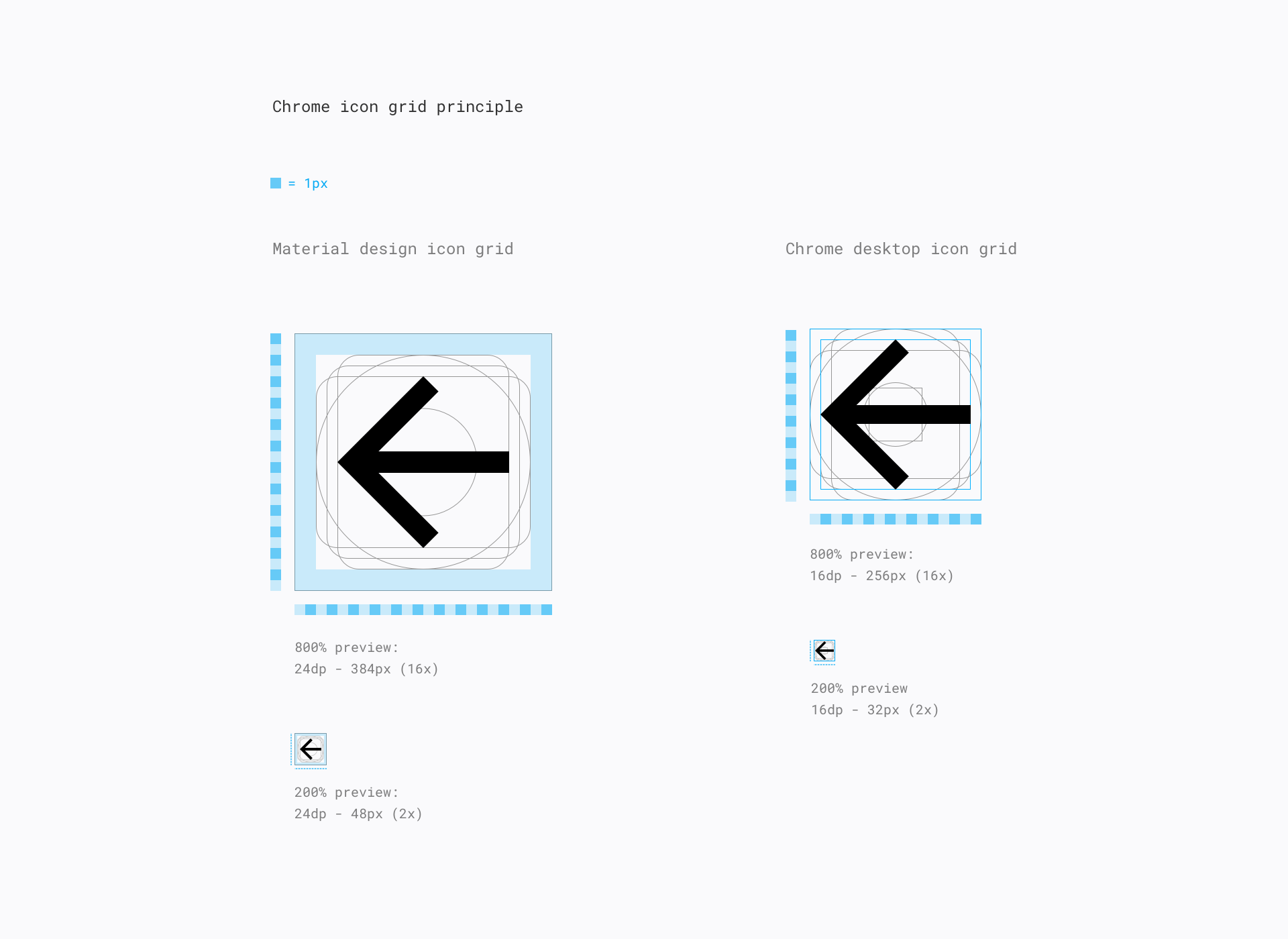 Iconography principle. Chrome follows a smaller grid than Material's to keep the UI more dense.
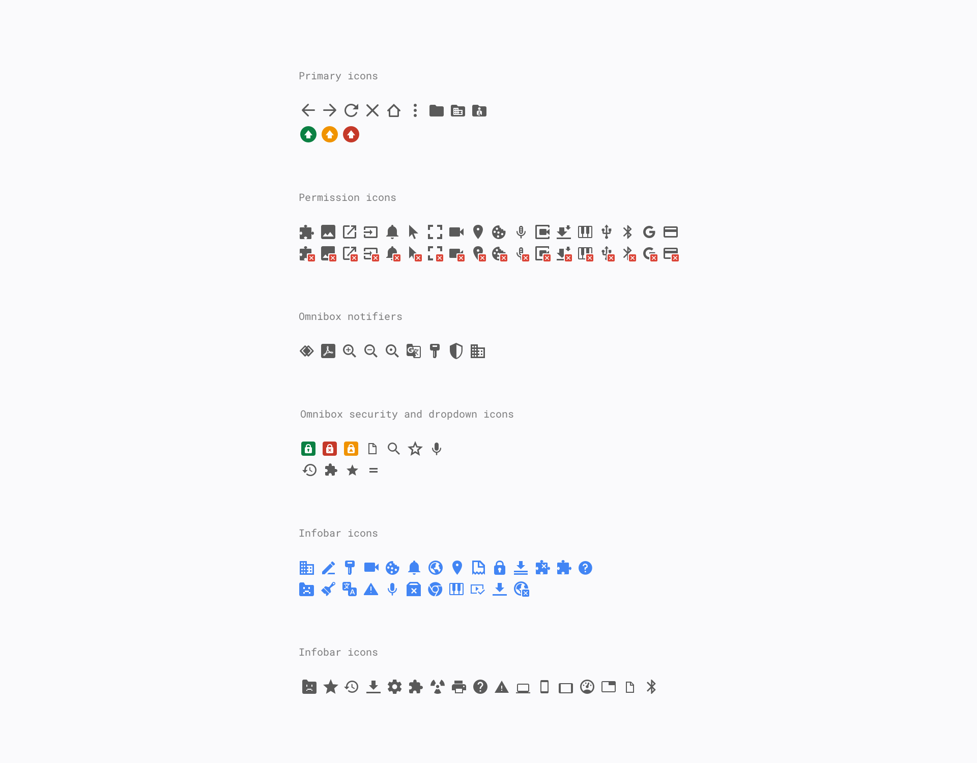 New iconography, rendered programmatically based on .svg.
 Infobar design, including the new buttons
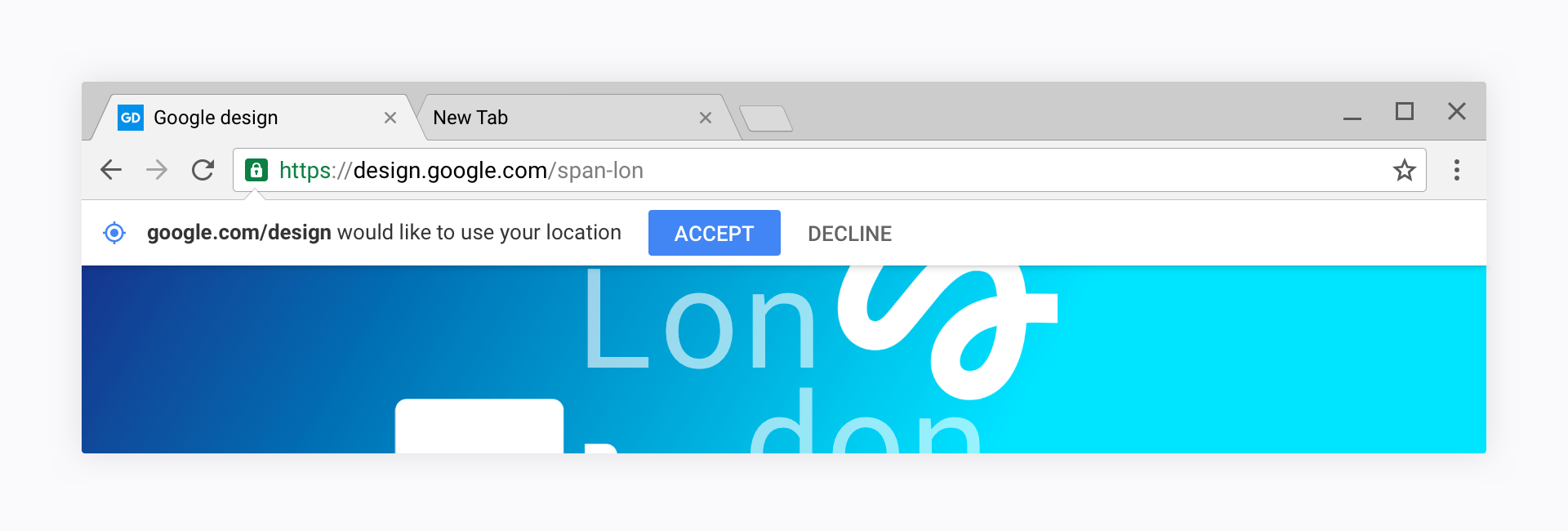 New infobar design in place
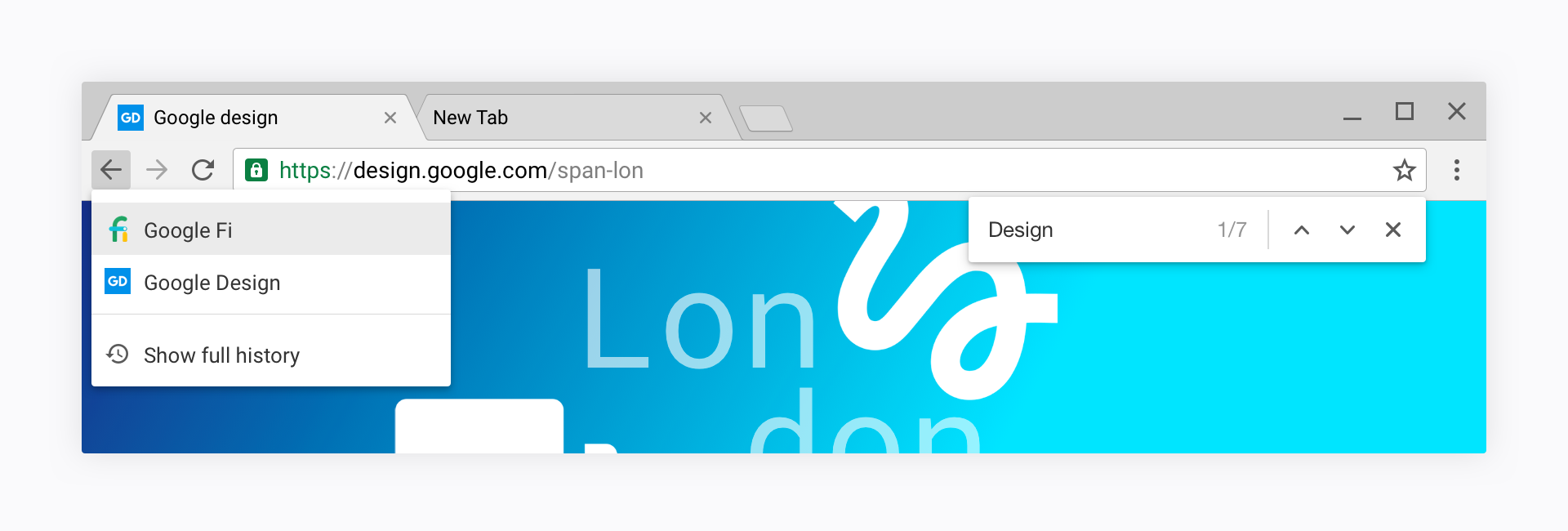 Back button history menu + find in page
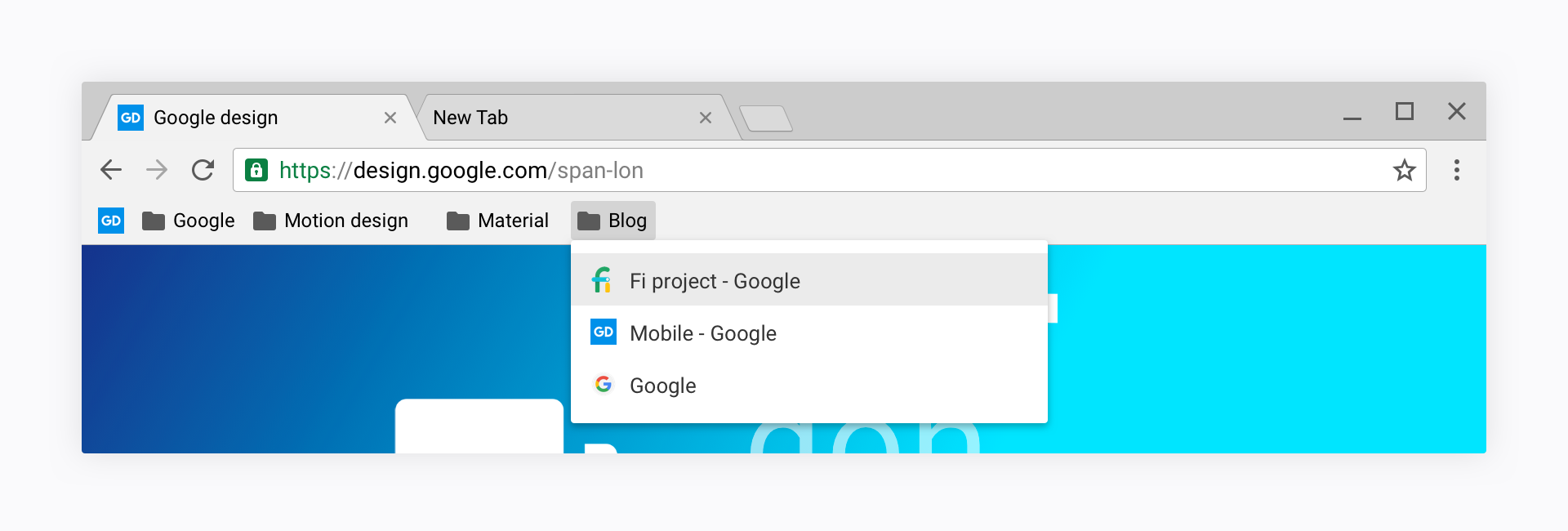 Bookmark menu
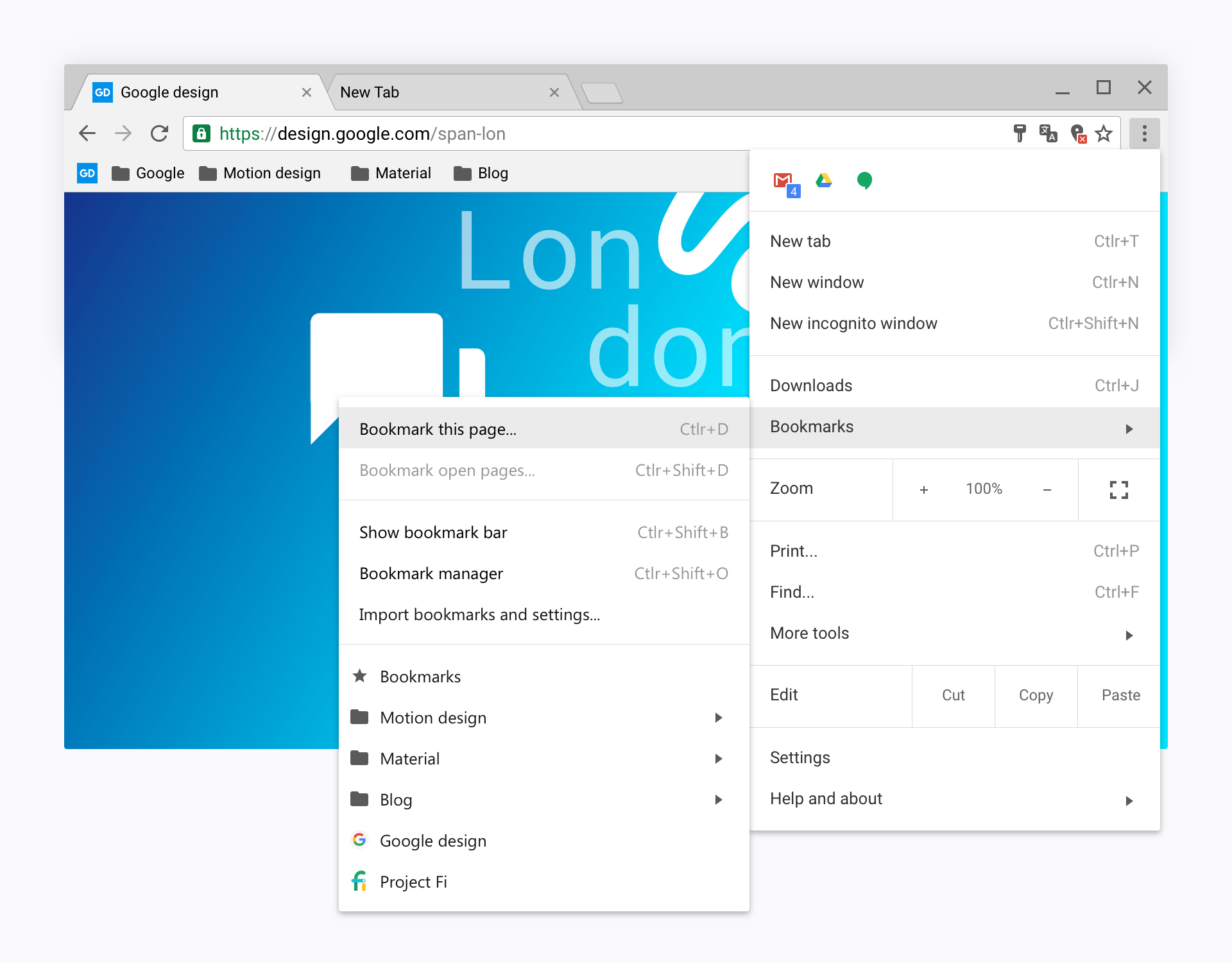 New settings menu with hidden extension row